Text/New Express reporter Liang Wei (data picture)
It’s another good spring, so use vibrant green to create your spring style. This season, the deep and shallow green will become the main color to awaken the spring, whether it is the combination of different shades of green or the color modeling with green as one of the main color schemes, it can bring a new and beautiful luster.
Focus A
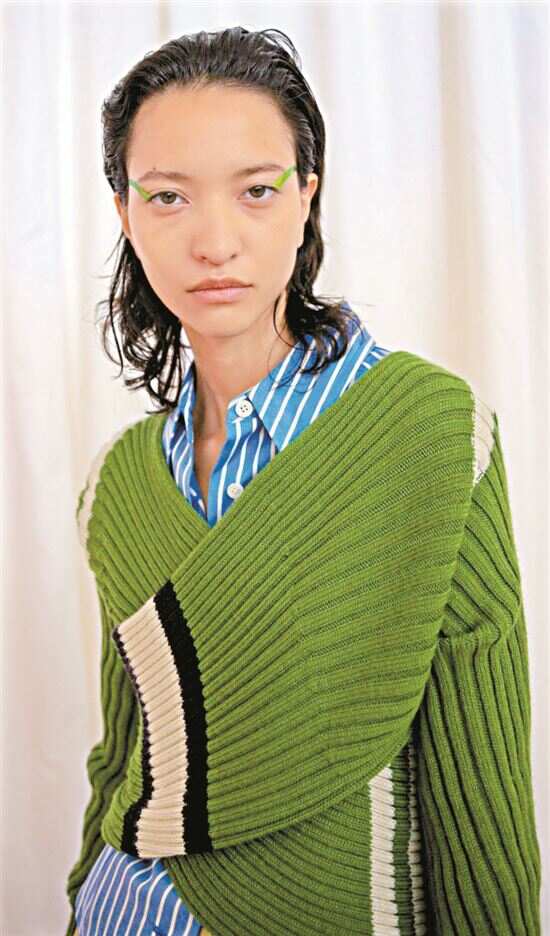
Green+green
Improve the texture of spring
Looking back at the popular colors in the past three years, green is almost never absent, and greens with different saturation and brightness take turns to play, demonstrating the fashion of the new season. In this year’s spring fashion week fashion color list, there are two kinds of green on the list.
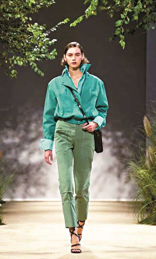
Mint green is recommended to use neutral color to slightly separate the face or expose the skin properly to avoid "no color".

Cabbage green is more elegant because of the gray tone, which is suitable as the main color of modeling and wearing in the transitional season.
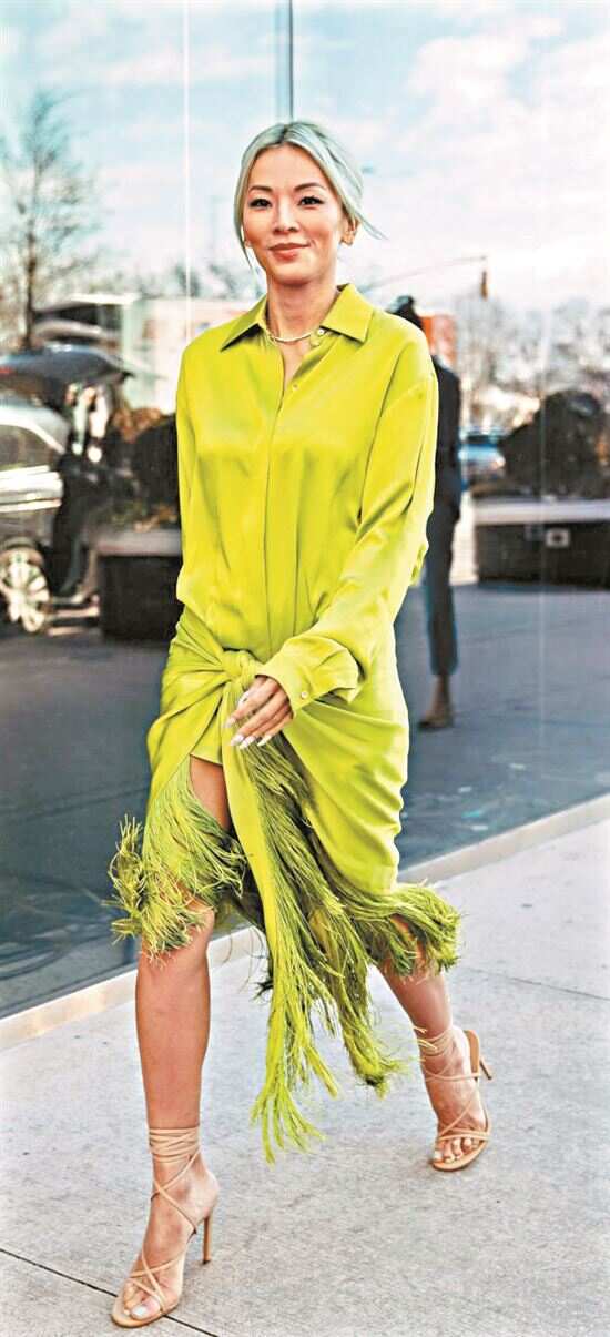
In spring, the tassel element is added to the green dress shape, which makes it more flexible.
One is the fresh watercress green. This color tone, which is not common in the popular colors in spring and summer in the past, is a color that can easily improve the overall texture, and it is particularly eye-catching when matched with the surrounding colors and neutral colors. In contrast, another popular green, mint green, is very cool and dazzling. It is suggested to choose the whole item or collide with other colors.
Focus B
Green+blue
Color matching is like a spring breeze.
The combination of green and blue is a group of adjacent color combinations that are very spring and fashionable and retro. In spring and summer, choose blue-green with low saturation, and you can wear a soft effect like a spring breeze.

When the brightness of green is high, it is more suitable to be used as an ornament color to create a lively feeling.
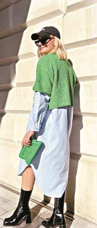
Blue with low saturation can replace neutral color and is very versatile.
As long as the saturation of green is moderate, it actually has a good brightening effect on the color.
When matching, put blue on the upper body as much as possible, because blue is easier to match all kinds of skin colors. This is actually a versatile dressing skill. When the main color and auxiliary color are neck and neck, the upper body chooses a color that is more friendly to skin color, and the accessories echo it, which can make the whole look more harmonious.
Focus C
Green+purple
Echoing romantic spring scenery
Green+purple, this set of contrasting colors is incompatible from a distance, but it is very eye-catching at close range, which can not only create a relaxed and casual spring and summer, but also harvest a bright and romantic in the clear and elegant.


The upper body uses purple to create temperament, and the lower body uses green to add vitality, and visually stretches the proportion of legs.
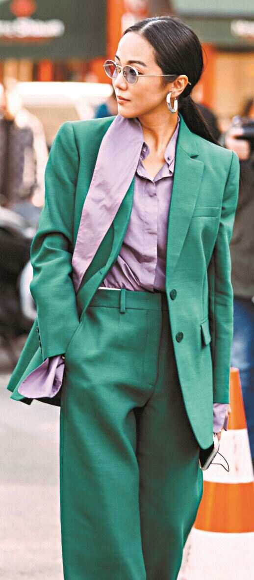
A little gray is added to both the green and purple tones, which makes TINT easier to control, but it is quite eye-catching.
Recommend a skill to wear green and purple in fashion-631 color matching principle, that is, 60% main color, 30% auxiliary color and 10% decorative color. With this color matching rule, you can boldly try some colors with high saturation, and you can easily match them with harmonious and layered wear.
If the upper body is green, the lower body must know how to create proportions, such as using a short top with a high waist and bottoms.
Focus D
Green+white
Highlight the lightness and spring rhyme
Green and all-inclusive white match, full of affinity and easily create a gentle atmosphere.

When it is matched with a large area of white, the brightness of green can be higher, which is a refreshing and bright existence.

When white or some neutral colors are matched with green, it can highlight the fresh texture of green and make green a shining focus.
With the resurgence of perspective elements, the combination of green and perspective white gauze can better show the lightness of spring.
Especially in different shades of green, adding different proportions of white will be more harmonious, advanced and soft on the whole, and it will have a tender spring charm.
关于作者